
Gaston: online wine store design
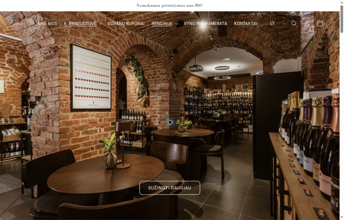
We adapted the design for the Gaston wine house online store based on the provided Figma elements. The core of the work was translating the visual direction into a store where both the presentation of the assortment and the character of the brand itself are essential.
Project brief
Adapt the provided design elements for the e-commerce environment, while maintaining a consistent Gaston visual style.
Our work
- Design adaptation based on provided Figma elements.
- Implementation of visual elements in the e-commerce environment.
Result
The store's appearance has been adapted to the intended design direction. The e-commerce environment has become part of the brand's visual identity.
Taking a design into the store
The supplied Figma elements already defined the visual direction for this wine merchant. Our role was to apply them where visitors actually encounter the range. The existing Gaston identity provided the starting point for translating the design into a working retail environment.
Store design and the buying journey
From a wine style to a tasting
Gaston offers white, red and orange wines alongside alcohol-free drinks, accessories and tastings. A visitor looking for a particular bottle has a different goal from someone planning an evening at a tasting. Both still need to recognise the same wine merchant as they move through the store.
What did adapting the design involve?
The client supplied the initial visual direction in Figma. Our role was to translate it into the online wine store. The difference between a mockup and a shop becomes apparent as people move from the brand introduction into a specific category. The design has to make the range understandable while keeping the Gaston identity recognisable.
A bottle and a tasting involve different decisions
A gift buyer may know neither the wine nor the producer. They need a way to narrow the choice. Another visitor arrives with a region or grape variety in mind and wants to recognise a label quickly. Both use the same store, but their first click may differ. Gaston illustrates why actual bottle photographs and names belong in a design review.
A tasting brings different questions about the occasion, location and experience. A bottle image might set the tone without answering any of them. Placing an event beside a product during a review shows which visual rules work for both and which information each page needs to bring forward.
How do you review a design in a working shop?
A long producer or region name can take two lines where the design used one. Check whether each price still clearly belongs to its bottle. Comparing two neighbouring products on a phone tests both the individual cards and the rhythm of the collection as a whole.
Preparing for a design review
Bring some extremes from the wine list to a review: a long producer name, a pale label that nearly disappears against its background, and a tasting offer without a conventional bottle photograph. Side by side they test type, spacing, cropping and button placement against the real content the merchant will maintain after handover.
Related project
Saula Lamps illustrates another role for product imagery. A wine label helps identify a producer, while a lamp shown in a room helps establish scale. In each case, distinguish what a collection image should communicate from the details that belong on the individual product page. That distinction helps scope the design and the photography.